
A marketer can spend hours finding a useful search topic, writing a focused article, and polishing the headline, then attach the first generic stock-style image that seems remotely relevant. That weakens the whole package. Search-focused content still has to earn attention when it appears in a feed, a newsletter, or a shared link. Tools such as Kimg AI can generate images or transform an existing reference photo, but the more useful shift is procedural: visual planning should begin inside the content brief, not after the article is finished.
Visual Intent Belongs in the Content Brief
Most content briefs define a keyword, audience, angle, headings, and internal links. Add one more field: visual intent.
Visual intent is a plain-language statement of what the main image should help the reader understand. For an article about reducing returns in an online clothing store, “e-commerce image” is too vague. “Show the difference between unclear and clear product presentation without changing the item” gives the visual a job.
This matters because the target keyword is not always the visual subject. A piece targeting “customer onboarding mistakes” does not need a floating word cloud that says ONBOARDING. A better scene could show a new user facing six confusing setup steps while another path presents three clear ones.
Start With Search Intent, Then Pick the Scene
Search intent describes what the visitor is trying to accomplish. A practical visual should help that goal.
For a how-to article, the image might make a process easier to grasp. For a comparison, it might show a controlled contrast. For a buyer guide, it may need to make the product category immediately recognizable. For a thought piece, it can introduce the tension behind the argument.
Imagine an article about improving local restaurant photos. The search intent is practical. A reader wants a better result from the images they already have. A useful visual might show the same dish in the same position, first on a distracting table and then in a cleaner setting. That is more relevant than a futuristic AI interface or a smiling marketer holding a phone.
Visual relevance comes from matching the reader’s task, not from inserting the keyword into the image.
Four Content Types That Benefit From Different Visual Treatment
One visual formula cannot serve every article. The content format should influence what you create.
1. How-To Content Needs a Visible Change
A tutorial promises movement from one state to another. Show that change. If the article explains how to improve a product photo, use one source and a controlled edited version. Keep the product stable so the reader can see what actually changed.
Avoid dramatic before-and-after images where everything is different. They may look impressive, but they teach very little because the viewer cannot identify the useful step.
2. Comparison Content Needs Controlled Variables
If you are comparing two approaches, the visual should not accidentally favor one through unrelated differences. Keep subject, framing, and scale similar while changing the factor being discussed.
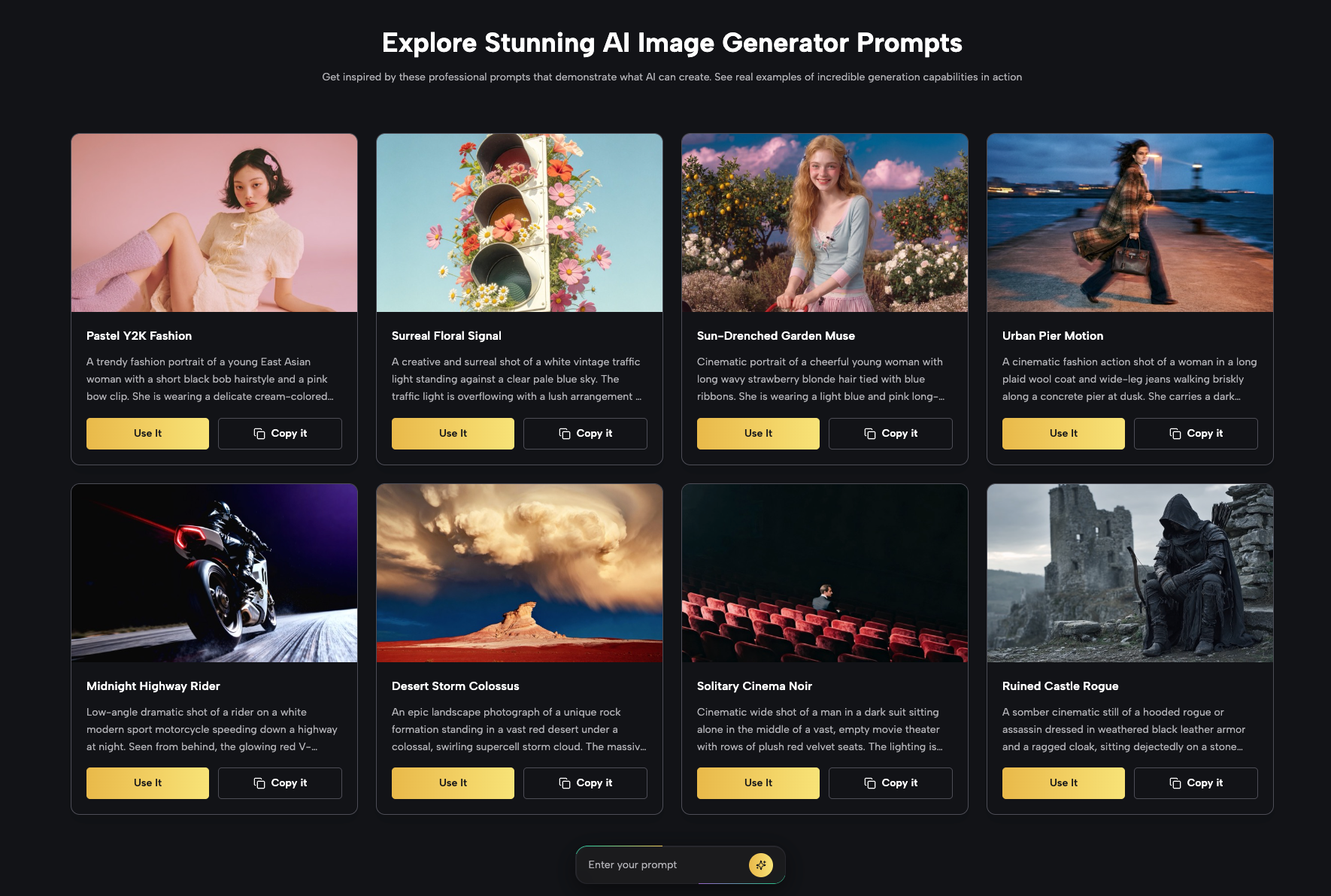
Reference-based editing can help with this. Nano Banana AI supports multiple reference images, so separate images can guide the subject, setting, or style when those roles are clearly described. The important part is not the number of references. It is keeping the comparison fair enough that the reader can understand the point.
3. Case-Style Content Needs Continuity
A case-style article often follows one business, creator, product, or problem through several stages. Its visuals should feel connected.
Use the same subject across the sequence and change only what the story requires. If a bakery improves its product presentation, keep the pastry recognizable while the background and composition evolve. If a creator tests several cover directions, preserve the central subject so the reader can compare choices rather than identities.
4. Thought Leadership Needs a Metaphor, Not a Diagram
An opinion article does not always have a literal process to show. Use one clear visual metaphor instead.
A piece about content overload might show a small desk disappearing beneath stacks of unfinished briefs. A piece about chasing every marketing trend might show several signposts pointing in conflicting directions. The image can be imaginative without becoming random because it still represents the article’s tension.
One Strong Source Can Produce a Small Set of Useful Assets
Marketers often think “repurposing” means resizing the same graphic. A better approach is to preserve the source idea while adapting the composition to different contexts.
Suppose you have a strong reference image of a handmade candle. The blog version might use a calm horizontal scene with room for the headline. A social version could move closer to the product and use a more immediate lifestyle setting. A newsletter visual might simplify the background because it will appear smaller.
These versions should not change the candle’s shape, label, or core color. The destination changes; the factual subject does not.
This is a useful place for reference-guided editing because the original image carries product information into each new version. The marketer can spend the prompt on context and composition rather than repeatedly describing the item from scratch.
If a short video is needed, start from the approved still and add one restrained action, such as a flame beginning to move or a hand placing the candle on the table. Motion should extend the concept, not replace it.
Create a Review Checklist That Matches the Article Goal
A generic “looks good” review is not enough. The checklist should follow the content brief.
For a product-related article, inspect product accuracy. For a tutorial, check whether the visual change is easy to identify. For a comparison, confirm that unrelated variables stayed stable. For a thought piece, ask whether the metaphor is understandable without a long explanation.
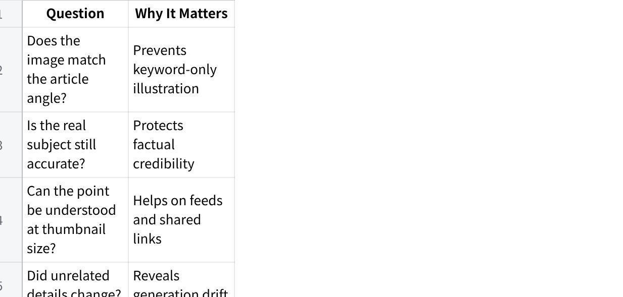
点击图片可查看完整电子表格
Also inspect text, labels, faces, hands, signs, and repeated objects before publishing. AI-generated polish can make a flawed detail easy to overlook.
Do Not Turn Every Article Into an AI Showcase
A visual can be technically ambitious and still be wrong for the content. Marketers sometimes overuse glowing interfaces, robots, impossible cityscapes, and dramatic effects simply because the article mentions technology.
Use the simplest scene that communicates the idea. A realistic desk may be better than a holographic command center. A straightforward product comparison may be better than an abstract explosion of icons. A clean portrait may be better than an elaborate fantasy transformation.
Let the topic determine the visual language. Technology content can be warm and ordinary when the reader’s problem is ordinary. Business content can be playful when the example calls for it.
The goal is not to prove that an image was generated. The goal is to make the article easier to notice, understand, and remember.
Conclusion
Search-focused content works best when the keyword, angle, structure, and visual all serve the same reader goal. Add visual intent to the brief, translate search intent into a concrete scene, adapt the visual format to the type of article, and preserve factual details when using references. Then review the image against the article rather than judging it in isolation. That process creates fewer generic covers and more useful supporting visuals. For your next content brief, add one sentence describing what the hero image should communicate before anyone starts writing the prompt.